- Represents a path between two points
- Can imply motion and suggest direction
- A line can be implied by multiple points and filled in by the mind
- A line is an effective element of design because it can lead the viewers eye
- Horizontal lines can represent peace and calmness
- Vertical lines can represent strength and power
- Diagonal lines can represent a change in motion and direction
- Curved lines can represent a quiet and calm feeling
- Zig-Zag lines also can represent a change in motion or direction
(AO:1. You must ensure that several of the visual ideas/inspirations within the image bank are pursued. )
AO1: Develop ideas through sustained and focused investigations informed by contextual and other sources, demonstrating analytical and critical understanding.
AO3: Record ideas, observations and insights relevant to intentions, reflecting critically on work and progress.
AO2: Explore and select appropriate resources, media, materials, techniques and processes, reviewing and refining ideas as work develops.
AO4: Present a personal and meaningful response that realises intentions and, where appropriate, makes
connections between visual and other elements.

Research of artists:
An artist i decided to research was Walker Evans. He was an American Photojournalist up until 1975. He is most known for his documents of the effects of the Great Depression, which are now featured in museums. His photographs are mostly of People, however there are some of his works which feature streets and signs. His images were photographed using black and white film to capture urban America. The high contrast in his images makes the features, such as signs, stand out.

The below images are examples of the types of photos i feel i could capture in Harlow. The styles reflect aspects of Walker Evans' work and further my research into him.


Here are the photographs i took that were inspired by these images and Evans' work.

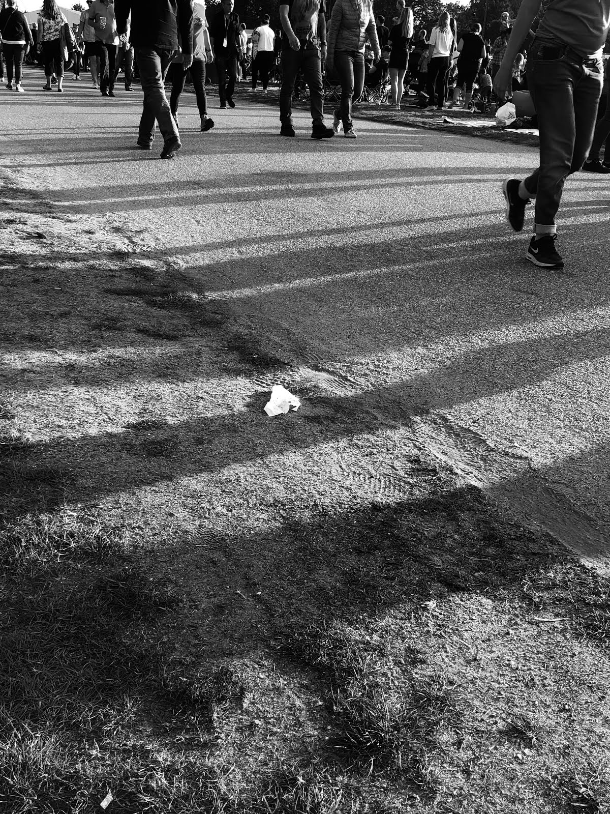
A few of my photographs did not turn out how i was hoping. for instance, image 0623 is slightly out of focus and the exposure was a bit too high for my preference. Another image that does not meet the standards is image 0619. This is because the focus was switched from the lines of the climbing frame, to the person in front. This was unintentional.
To improve my photos for next time, i will pay close attention to the exposure, be sure to focus on the right aspects of a photograph and perhaps use a tripod to keep the camera more still.


In comparison, i really liked some of my pictures and i think they successfully link to the topic of lines and my research of Walker Evans. An example of a photo that i think is successful is image 0626. It really reflects Walker Evans' style and the camera settings used were correct for the shot. I went on to further edit this photo on Photoshop. I adjusted the contrast, saturation and sharpness before putting a black and white filter on it. I did this the ensure the whole focus was on the white street paint. Another photograph that I think was successful is image 0621. This is because i adjusted the aperture to make the texture on the front bar stand out. The curved lines in the back are out of focus and this makes the front curve stand out most to the eye. I used the same editing process on this photograph.
Best Images:


The intentions for these photos was to feature lines and reflect Walker Evans' photography. I used a mixture of a Canon EOS camera and aperture f/4 and the camera on an Iphone 8 which has an aperture of f/1.8. I then used photoshop to edit and finish these pictures.
 →→→→
→→→→ 
 →→→→
→→→→ 
Below are my final pictures:


Overall Analysis:
Overall, I believe that I achieved what I wanted to and that an amount of my pictures were successful. In my opinion, they reflect all of the research done and the different styles I wanted to investigate. The use of Black and White edits help to stop the eye being distracted by the colours and focus more on the lines in my photographs. The different compositions and angles of the camera enable me to capture alternative lines that may not be seen by the regular eye. For example, edit number 1 is taken from a low angle, creating Lines in a tube carriage which would not normally be seen from the average human eye angle. In edit number 2, the aperture was altered to f//4 to create the background blur. this brings the main attention to the from curved line. The lighting in edit 3 creates shadows which are the lines captured in this photograph. By editing the contrast and saturation levels on photoshop, I could make these shadows stand out. Connotations with these images could include the idea of the structure of society. Many people interpret this as the people that make up society but this series could look into the physical structure of Harlow. If I were to reshoot these photograph, I would use a tripod in order to get sharper images that don't have blur. I would also look into a different editing style and keep some images in colour, however this would stray from Walker Evans' style. In conclusion I believe that my series of photographs was successful.


a very good post and write up, well done, try to show more work linked to Photoshop edits from this point forwards. I like the way that you have worked on the contrast.
ReplyDelete