

In both of these songs, the colours from the videos represent the moods of the songs and the vibes that they give off. in Yellow, the colours start off being very dull and unsaturated. this correlates with the minor key and sad tones in the song. The lyrics describe his love and as the video progresses, the colours begin to brighten up. Similarly to this, in Tears Dry On Their Own, the beat is fast and the tone of her voice suggests she is happy, as well as the vibrant colours.
Definition:
colour; the property possessed by an object of producing different sensations on the eye as a result of the way it reflects or emits light.
This definition could also be interpreted as the different tones that light reflects off of things, whether they are saturated or non saturated, or vibrant or dull.
Colour and emotion:
Some examples of the emotions that can be implied by colours are:
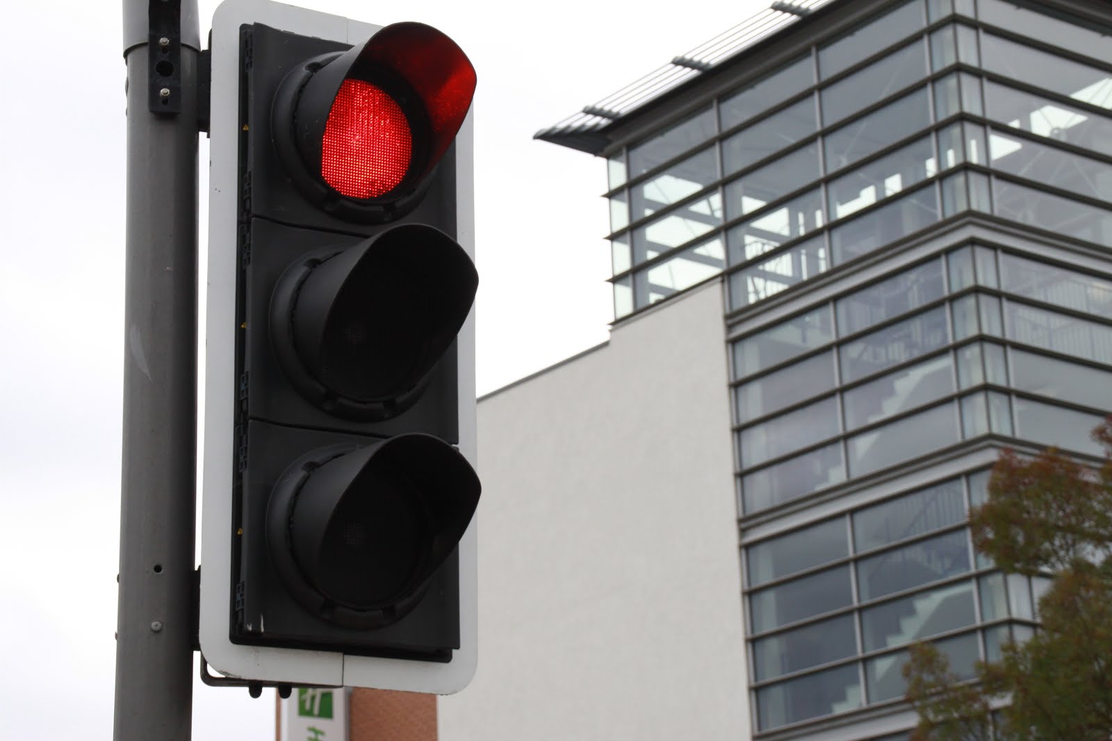
-Red: anger, stop, danger, love, hate.
-Orange: happy, energy, sun, vibrance.
- Yellow: peace, sunshine, flowers, joy.
- Green: nature, wealth, fresh, jealousy.
- Blue: sadness, depressed, isolation.
- Purple: spiritual, calming, creative, rare.
Colours:
 Saturated: vibrant and radiative colours. (orange, yellow, red)
 Muted: a dull colour that doesn't stand out thats mixed with black. (blue, green, purple)
Primary Colours: blue, yellow, red.
 Secondary Colours: purple, green, orange.

Contrasting Colours: blue&yellow, red&green.
Analogous Colours: orange-yellow, blue-green.
(AO:1. You must ensure that several of the visual ideas/inspirations within the image bank are pursued. )
AO1: Develop ideas through sustained and focused investigations informed by contextual and other sources, demonstrating analytical and critical understanding.
AO3: Record ideas, observations and insights relevant to intentions, reflecting critically on work and progress.
AO2: Explore and select appropriate resources, media, materials, techniques and processes, reviewing and refining ideas as work develops.
AO4: Present a personal and meaningful response that realises intentions and, where appropriate, makes
connections between visual and other elements.
 William Eggleston was born in Tennesse, 1939. He is mostly known for his American culture photography that focuses on colour, which now features in art museums. Eggleston was showing creativity from a young age, when he enjoyed playing the piano and drawing. He first began taking photographs in black and white and then later developed into using colours. Eggleston sees the complexity and beauty of the mundane world: "The extraordinary, compelling, honest, beautiful and unsparing photographs all have to do with the quality of our lives in the ongoing world: they succeed in showing us the grain of the present, like the cross-section of a tree.... They focus on the mundane world. But no subject is fuller of implications than the mundane world!"


Connotations/Denotations:
Eggleston's pictures feature highly saturated colours with warm tones. They feature American scenes in the 50's and the colour schemes are reflective of the era. There are many primary and contrasting colours in the photographs.
The first two images show people whereas the last two show landscapes. All of these pictures however seem to show a decisive moment where William Eggleston has wanted to capture a specific scene.
Image bank of photographs that I could take in and around Harlow that are inspired by William Eggleston:


These photographs were taken by other artists but have a similar style to Eggleston. I intend to recreate similar pieces to this which feature urban accents and vibrant colours.
Despite Harlow being a dark and dull town, Using a good eye and photoshop techniques i could create some very vibrant pieces.
Below are the pictures I took:


Many of the pictures that i took did not go as to plan. some examples of these are IMG_7352, IMG_7370 and IMG_7354. The reasoning for these not being successful photos is because they are dull and bland. Most of the colours are muted and therefore there is no vibrancy. IMG_7352 is blurry due to the camera not being held still enough.
To improve these shots next time i should adjust the exposure on my camera. This will allow more light into the lens and therefore brighten the picture. I also could use a tripod which will help keep the camera more still, ensuring less blurry photos.
Pictures to Improve:


I think that these photos were successful and have turned out well due to having the right exposure on my camera. There is a good amount of light in the frame which makes the colours vibrant. The shutter speed which I have used (1/250") has ensured that the pictures I took were in focus.


I took these pictures using a Canon EOS camera. I will edit them using photoshop where I'll saturate or mute colours, crop images and use curves on the levels of brightness, hue, etc. My intentions when taking these pictures were to recreate some similar to Eggleston's work and capture the different aspects of colour. Being in Harlow could prove this hard, however after discovering many colourful places I managed to take some successful photographs. The shutter speed used for most of them was 1/250" with the aperture at f/8.
Here are some different edits of a picture I took that explore how you can alter colours on photoshop:
 Original Photo
 Highly Saturated Photo
 Highly Muted Photo
 Black and White Photo


Final Photos:


Overall Analysis:
In conclusion, I think that i was successful in taking relevant photographs to the subject. They reflect all of the artist research done and the different styles of pictures that I wanted to investigate. The use of saturated and muted colours edits display the different uses of colour in photographs and allow me to develop editing skills by using Curves and other adjustments. Focusing on colour made me looks further into my usually very dull town to find hidden colour. For example,on flowers or bright street signs. These are typically the types of things that William Eggleston photographed.In edit 1, I took inspiration from Eggleston's photos of street signs and then went ahead to photoshop where i saturated the colours and edited the brightness. This worked well as it demonstrated the different ways we can alter colour. The first two edits relate to William Eggleston's theme of urban streets and signs, whereas the last three edits link to his brightly coloured works featuring flowers. Whilst exploring colour, I used different editing techniques in order to have some highly saturated final pieces and some that are muted. This shows the variation in colour and a higher level of editing skills. If I were to reshoot this series of photographs i could improve them by changing the aperture and ISO. I would also consider using a tripod to ensure that all of my photographs taken have high focus and are completely still. This would therefore eliminate any blur throughout the images. This could enhance the colours due to the change of light on the frame. Overall I believe this was a successful series of photographs that link to Eggleston's style.


please follow the set structure for blogger. The images you have presented are good but I am not sure that you have selected the best, please review with the tutor..
ReplyDelete